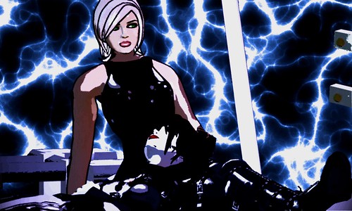
I've been playing around quite a bit in the current comic
series with images captured in Second Life. Over the past few days I've gone in a new direction and here are a couple of initial images. The first is a retouching of a graphic used in a previous comic page. The second is a work clip from an upcoming comic page that will hopefully be out by midweek.


3 comments:
I feel that I vastly prefer the first image to the second, and not just because I'm in it! Thick set lines like that really work well in a dark frame, however lighter colours as in those of the monk's robes tend to be washed out a little. It's tough, as of course one would always want for consistency in a comic's style, but perhaps you could develop a few styles for the different moods your stories portray?
vidal: I gravitate towards inconsistency. Do you think that's a problem?
Nice images! The first one is more visually striking at first, but I like the recursiveness of the second - if I'm not mistaken, vidal, you're in the second image too in the art on the wall!
Post a Comment